A welcome-email checklist: help the customer take one useful next step
Rewrite a welcome email around one useful action, then add relevant personalization, readable visuals, and a fallback. Includes a worksheet and example.
Your welcome email arrives at a useful moment: someone has just asked to hear from you or started using your product. Give them a clear way to make progress.
Start with one question: what would help this person take the next step toward the result they signed up for?
That answer should shape the message, the button, the destination, and any image you include. Here is a complete example you can adapt.
Weekwell and every recipient in this example are fictional. This is a design exercise, with no measured performance results.
1. Define the customer and the first useful action
Weekwell is our fictional meal-planning app. Maya has created an account and selected “Quick dinners” as a preference, but has not made a menu.
Her immediate problem is deciding what to cook. A useful first action is choosing three dinners for her first weekly menu.
Write the brief in one sentence:
Help a new Weekwell customer who wants quick dinners choose three meals for their first menu.
This is specific enough to guide the copy. It also gives us a destination: the meal-selection screen. If the button sends Maya to a general dashboard, the email has handed her the decision all over again.
2. Give the message a clear hierarchy
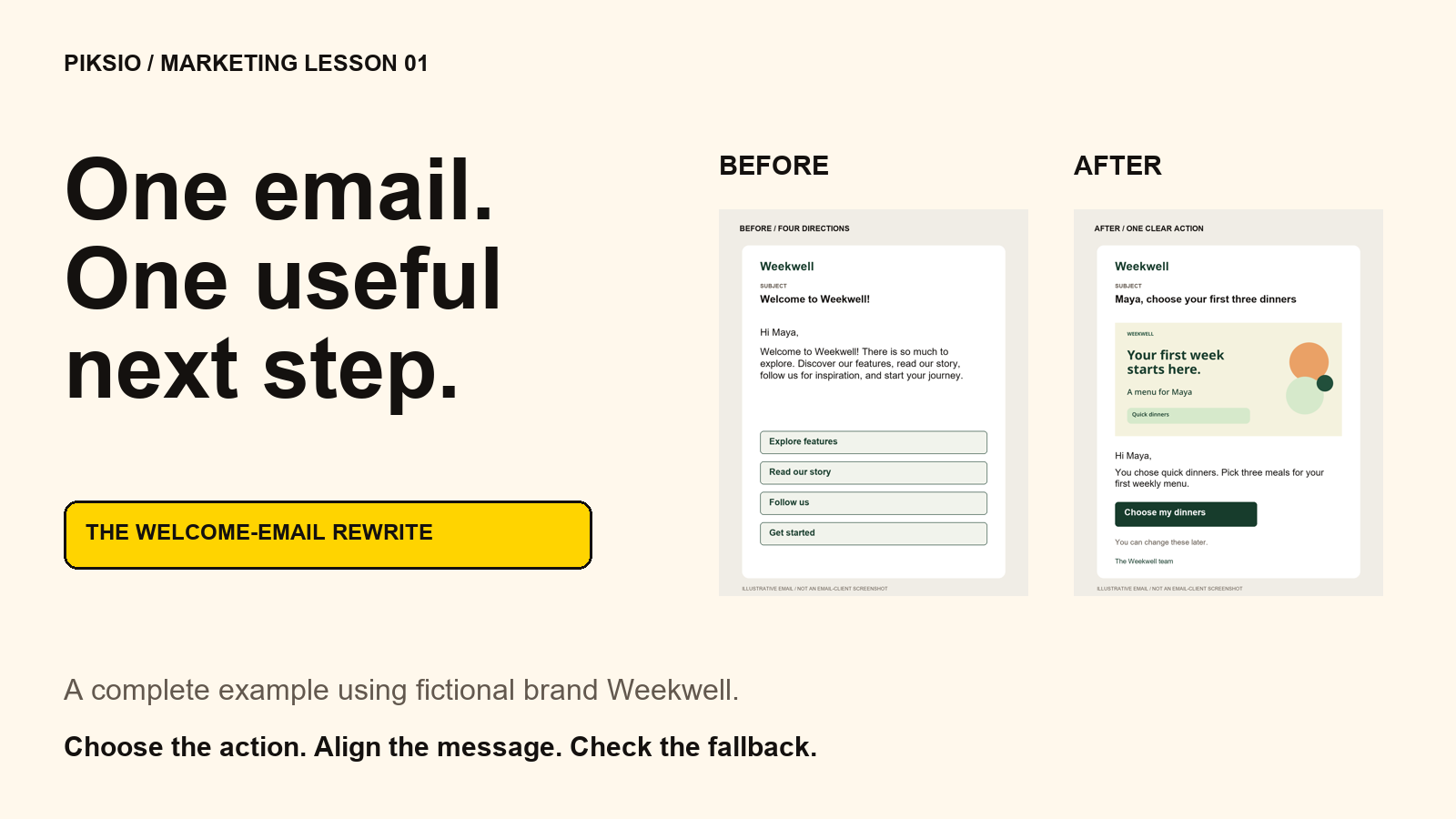
Imagine the first draft:
Welcome to Weekwell! Explore our features, discover our story, follow us on social, and start your journey.
The reader has several directions to choose from. We can move the company story and social invitation into later messages and make the first useful action prominent.
Try this rewrite:
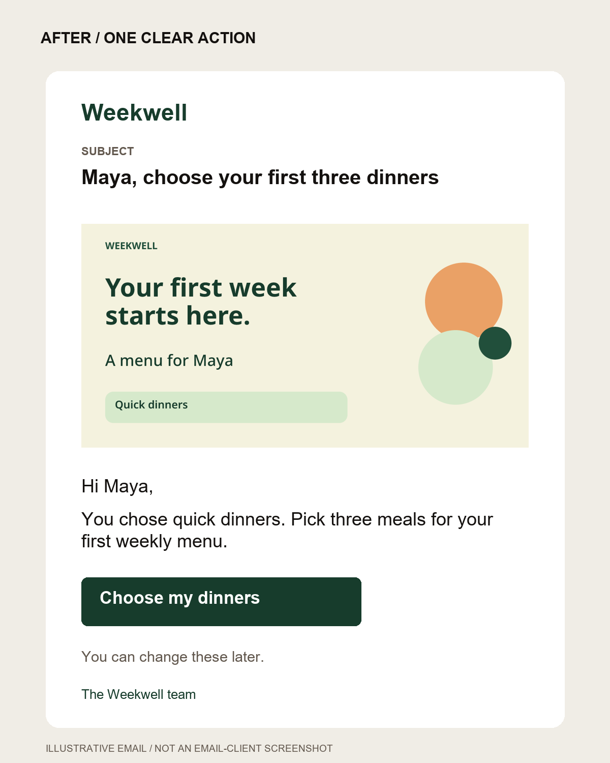
Subject: Maya, choose your first three dinners
Preview text: Start with your quick-dinner picks.
Hi Maya,
You chose quick dinners. Pick three meals for your first weekly menu.
Choose my dinners
You can change these later.
The subject, body, and button now point to the same task. The last sentence reduces uncertainty without inventing urgency.
Required account links and relevant help can still be available. This is a recommendation about the main action and visual hierarchy, rather than a rule that every email must contain exactly one link. A verification email or urgent account notice will need its own purpose.
3. Personalize from information the customer gave you
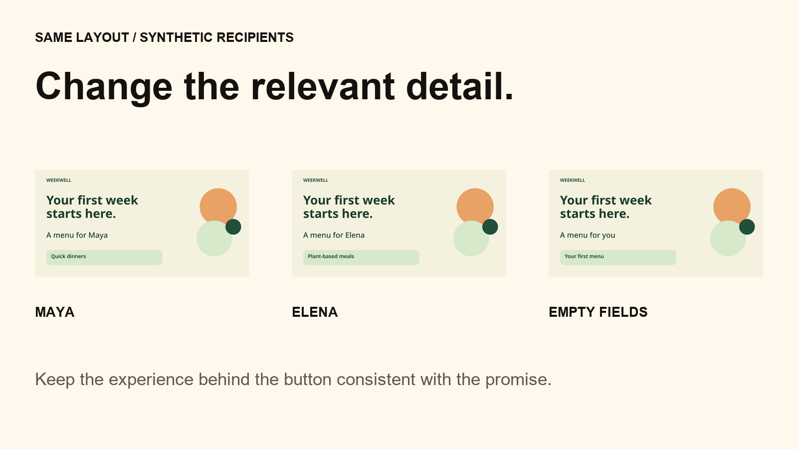
Maya's name makes the message feel addressed to her. Her selected preference gives us a reason to change the content.
For a customer who selected plant-based meals, the corresponding message could explain that their menu starts with plant-based choices. Only say this if the destination actually honors that preference.
In our example we use two fields:
| Field | Maya's sample value | Saved fallback |
|---|---|---|
| first_name | Maya | you |
| meal_goal | Quick dinners | Your first menu |
These fields belong to the image template. Map them to the fields already available in your sending platform; avoid collecting an extra detail just to fill a design.
I'm the founder of Piksio, which creates personalized images for email. For this example, I made a reusable card with the heading “Your first week starts here,” the line “A menu for Maya,” and a preference label. The same layout can show another recipient's values.
The supplied Piksio template JSON contains the design and saved image-field fallbacks. Open the Piksio editor, choose More → Import JSON, select the file, then preview your own sample values before saving.
4. Keep the message useful when the image is unavailable
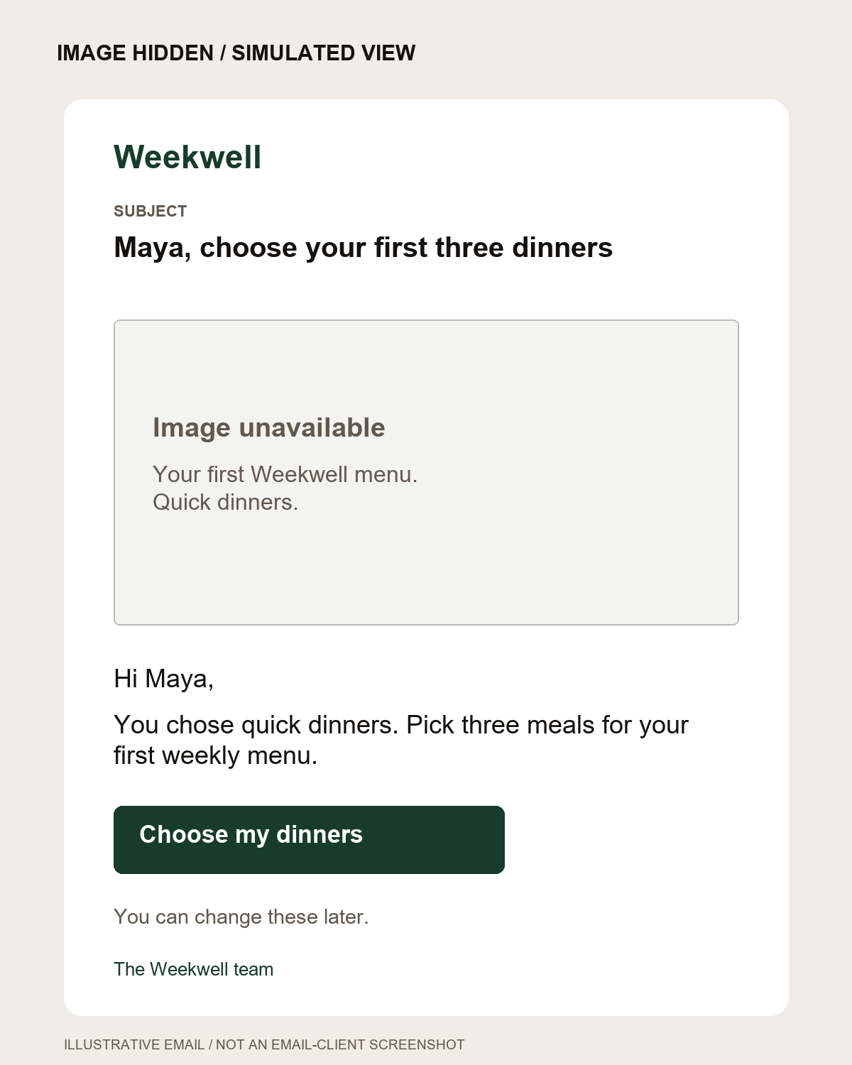
Use the image to reinforce the message. Keep the task and button in the email's HTML text.
For Weekwell, the body still says what to do: choose three dinners. The button is outside the image and leads to the meal-selection screen. If the image does not load, the customer can still understand and take the next step.
Choose alternative text based on the image's purpose. An informative image needs a useful text alternative; a purely decorative image can use an empty alt attribute. In this example, “Your first Weekwell menu. Quick dinners.” conveys the card's supporting information. See the W3C guidance on informative images and Mailchimp's guidance on HTML calls to action.
5. Make missing data a normal case
When the image's first-name field is blank, “A menu for you” reads naturally. When the preference is missing, the label becomes “Your first menu.”
The email's surrounding copy needs its own fallback in your sending platform. Piksio's image fallbacks do not rewrite that text. Our generic email version begins “Hi there” and asks the customer to choose three meals without asserting a preference we do not know.
Preview a complete recipient, a long name, and a recipient with empty fields. Confirm the destination handles each case too.
6. Treat the redesign as a hypothesis
The before-and-after example changes copy, hierarchy, and the supporting visual. It does not tell us which change will improve a real campaign.
To test the added personalized visual, keep the copy, offer, audience rules, timing, and destination consistent. Compare a fixed visual with a recipient-specific version of the same layout. If you also change the image's wording, describe the result as the effect of that whole treatment.
For this fictional app, a possible primary outcome is the share of eligible new accounts that choose their first three dinners within seven days. Choose the window and sample plan before starting, using your own customer journey and baseline. Track clicks as supporting information; they do not establish completion of the task.
Your five-question checklist
- Who is receiving this message, and what have they already done?
- What single next action would help them make progress?
- Do the subject, body, button, and destination support that action?
- Does personalization use known, relevant information with sensible fallbacks?
- Can the person understand and act when the image is hidden?
Use the welcome-email worksheet to plan your version. The example copy, synthetic recipient data, and Piksio template are included in the companion resources. Start with the customer action; use the visual where it earns its place.
Comments